Google, Tremendous and a11y: making payouts accessible for all
By Ian Floyd●10 min. read●Oct 10, 2024
One in four U.S. adults and nearly 1 billion people worldwide live with disabilities. When websites aren��’t built with digital accessibility, or “a11y,” in mind, navigating the web can be a nightmare. When Google approached us about ensuring payouts were accessible to all, we jumped at the opportunity.
“You’re clicking on something that says, ‘graphic graphic graphic,’ or some numbered file name, or some gibberish like that.”
That’s how Lucy Greco, a digital accessibility evangelist who is blind and uses a screen reader to navigate online, described using apps and websites that aren’t accessible in a 2019 Wired magazine article.
That experience is all too familiar to anyone who relies on screen readers or other assistive technology to wayfind online. It’s also an example of the type of experience Google’s UX team sought to avoid for research participants—many of whom have disabilities.
Working closely with Google’s user research team over the span of several months, our designers and engineers improved the usability for users with impaired vision or those who rely on screen readers. Now, it's easier than ever for all types of users to redeem payouts via Tremendous.
“Tremendous prioritized accessibility product improvements to create an all-around better experience for all our users,” said Lily Chai, Google UX infrastructure program manager. “We've received positive responses from our users, and it's helped Google deliver on our promise to build products for all types of users globally.”
Here's our journey.
TL;DR:
Google’s UX team frequently conducts accessibility research. They compensate participants for their time and input.
Google wanted to use Tremendous to pay participants. While accessibility is important in all cases, it was critical for the participants in accessibility research.
Tremendous worked with a consultant to conduct an accessibility audit and found 58 minor accessibility issues—everything from color contrasts to HTML heading tags to ARIA labels.
Tremendous fixed these issues. Moving forward, we’re committed to adhering to all WCAG 2.0 AA accessibility guidelines, the gold-standard for accessibility.
Google + Tremendous
Google uses Tremendous to pay thousands of people each year who participate in user experience (UX) and accessibility research.
Many of the research participants rely on screen readers to navigate online, and it’s important to Google that these participants enjoy a seamless experience on Tremendous when collecting their payment.
At Google’s suggestion, we hired an independent auditor, Deque, to review our product and determine how well they conform to the leading international standards for web accessibility.
What is a11y?
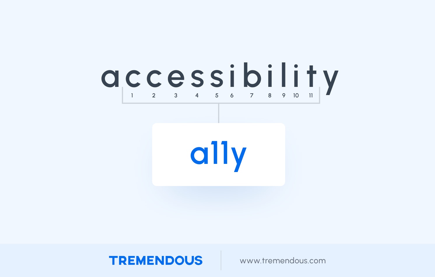
The word “accessibility” has different meanings in different contexts. On the Internet, the use of the term “a11y” helps identify content related specifically to digital accessibility.
“a11y” is a numeronym, or number-based word, that’s generated by taking the first and last letters of “accessibility” (a and y) and the number of letters between them in the English alphabet (11). It’s commonly pronounced one of three ways: “A-one-one-Y", “A-eleven-Y", and, more loosely, as “ally."
Other common numerononyms include things like a16z (the venture capital firm), P2P (“peer to peer”), and WWII.
Understanding WCAG guidelines
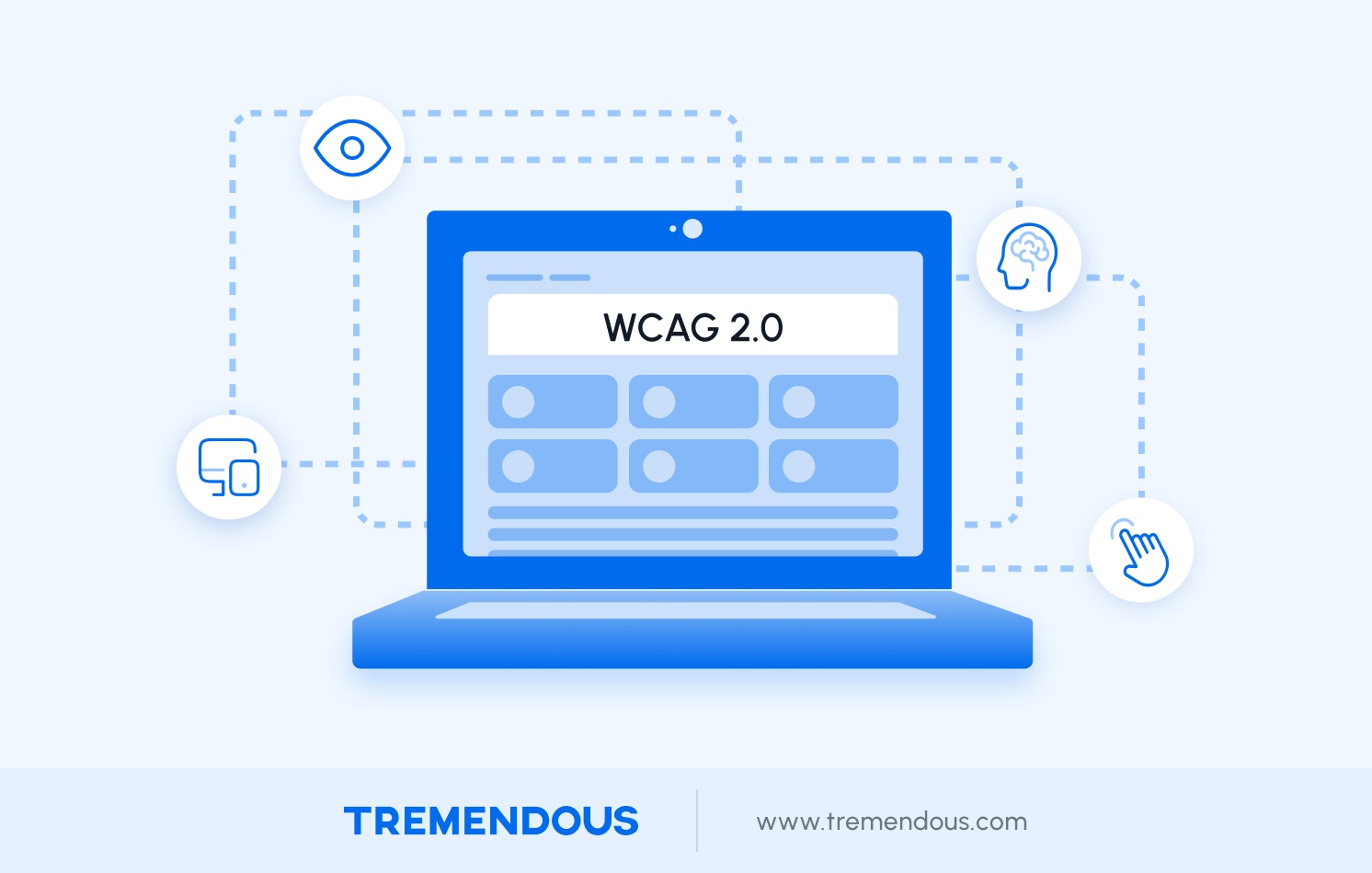
The Web Content Accessibility Guidelines (WCAG) are published by the main international standards organization for the internet—the World Wide Web Consortium (W3C)—and aim to make web content more a11y friendly, or digitally accessible, for people with disabilities.
WCAG 2.0 are detailed and specific about how to implement software that can interact with assistive technology, like screen readers.
Here’s an example of just a few of the thousands of instructions you can find in the WCAG 2.0 AA guidelines:
G10: Creating components using a technology that supports the accessibility API features of the platforms on which the user agents will be run to expose the names and roles, allow user-settable properties to be directly set, and provide notification of changes.
G15: Using a tool to ensure that content does not violate the general flash threshold or red flash threshold.
G17: Ensuring that a contrast ratio of at least 7:1 exists between text (and images of text) and background behind the text.
G18: Ensuring that a contrast ratio of at least 4.5:1 exists between text (and images of text) and background behind the text.
G19: Ensuring that no component of the content flashes more than three times in any 1-second period.
G21: Ensuring that users are not trapped in content.
G53: Identifying the purpose of a link using link text combined with the text of the enclosing sentence.
While earlier versions of these guidelines offered just 18 main recommendations, the most recent version is substantially more comprehensive, providing detailed instructions on how engineers and designers can adapt and build digital products that are easily understood by assistive technology.
The guidelines follow four foundational principles for content accessibility:
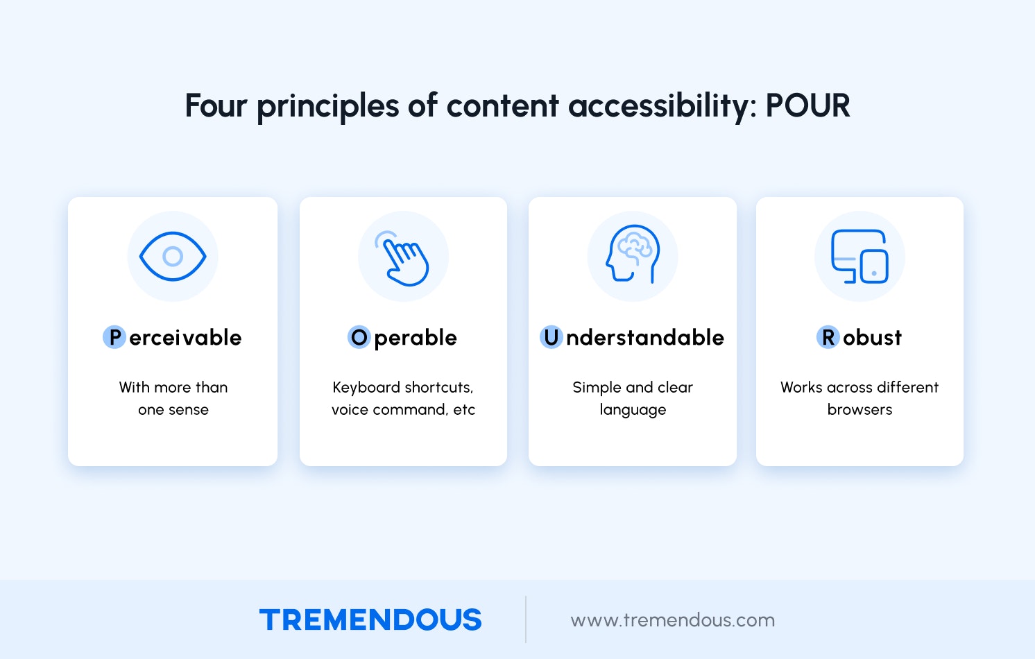
Perceivable: The guidelines remind designers that not everyone relies on the same senses. Users must be able to perceive it in some way, using one or more of their senses (e.g. weight, touch, and sound).
Operable: Users must be able to control UI elements (e.g. buttons must be clickable, such as by keyboard shortcuts or voice command).
Understandable: The content must be understandable to its users. The website should use clear language, offer simple instructions, and explain any issues that are complex.
Robust: The content must be developed using web standards that will work across different browsers, now and in the future (e.g. using clean CSS and HTML).
There are varying degrees of completeness when it comes to WCAG guidelines: A, AA, AAA.
The A compliance level is the minimum adherence to accessibility standards, and AAA is reserved primarily for specialized sites. AA is what most websites strive for—and this was Tremendous’ goal.
How screen readers work and why they’re important
As the name implies, screen readers “read” content on the computer’s screen and web browsers—things like text, images, links, and action buttons. The assistive technology then translates that content into either speech or refreshable Braille.
Keyboard shortcuts allow users to do things like read out text, click on an action button, or navigate to other sections of a website.
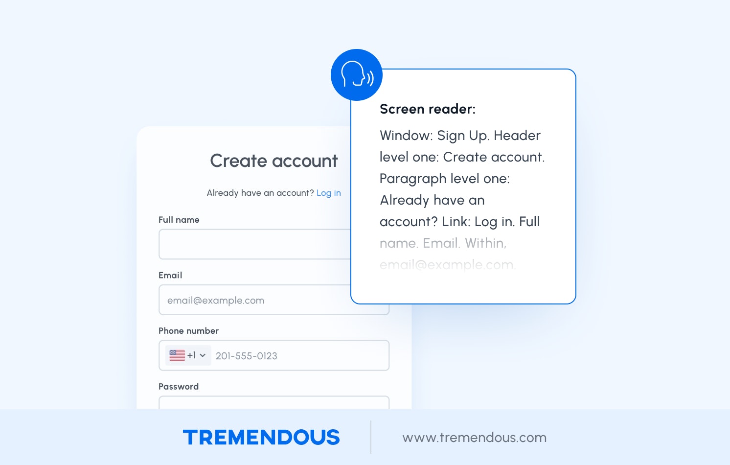
Here’s an example of how a screen reader sounds while redeeming a payout on Tremendous.
Screen readers are used by people with vision impairment to navigate and interact with web content. They’re also used by people with more temporary conditions, like a broken arm, or who simply want to customize their web browsing experience to suit their needs.
But many websites contain errors that make large parts of the internet completely inaccessible—simple things like button labels and forms without description copy.
These errors and omissions are the norm. Users with disabilities encounter errors on 1 in every 19 elements on home pages, with 96.8% of all home pages having some form of WCAG 2.0 failure, according to the Web Accessibility In Mind’s 2022 accessibility audit of the top 1 million home pages.
Because screen readers offer different modes for processing and interacting with the content, the WCAG 2.0 guidelines help developers navigate the complexity and identify areas to improve.
Accessibility audit and prioritization
Over several months, independent auditors at Deque assessed how easy it was for four main personas—blind, low vision, dyslexia, and older adults—to use the leading screen readers to navigate Tremendous’ reward redemption process.
Auditors used multiple browser and device types to see how well they conform to the WCAG 2.0-Level AA guidelines and ranked any issues they found according to the severity. For example, if a user couldn’t navigate the main functions of the site with voice-assist technology or if visual content was at risk of causing dizziness from certain users, those would be flagged as high-priority items.
Auditors reported they were able to complete all major processes on Tremendous—like redeeming a reward and using a prepaid card—and found no high-priority items. Tremendous scored well overall for being accessible, both in terms of the design and technical implementation (like how easily third-party screen readers and voice-assist software can understand and interpret design and copy). But there was still room for improvement.
Auditors identified 58 lower priority issues. At face value, some of these may appear minor or even nitpicky to the untrained eye. But they can impact the experience of a user relying on screen reading technology.
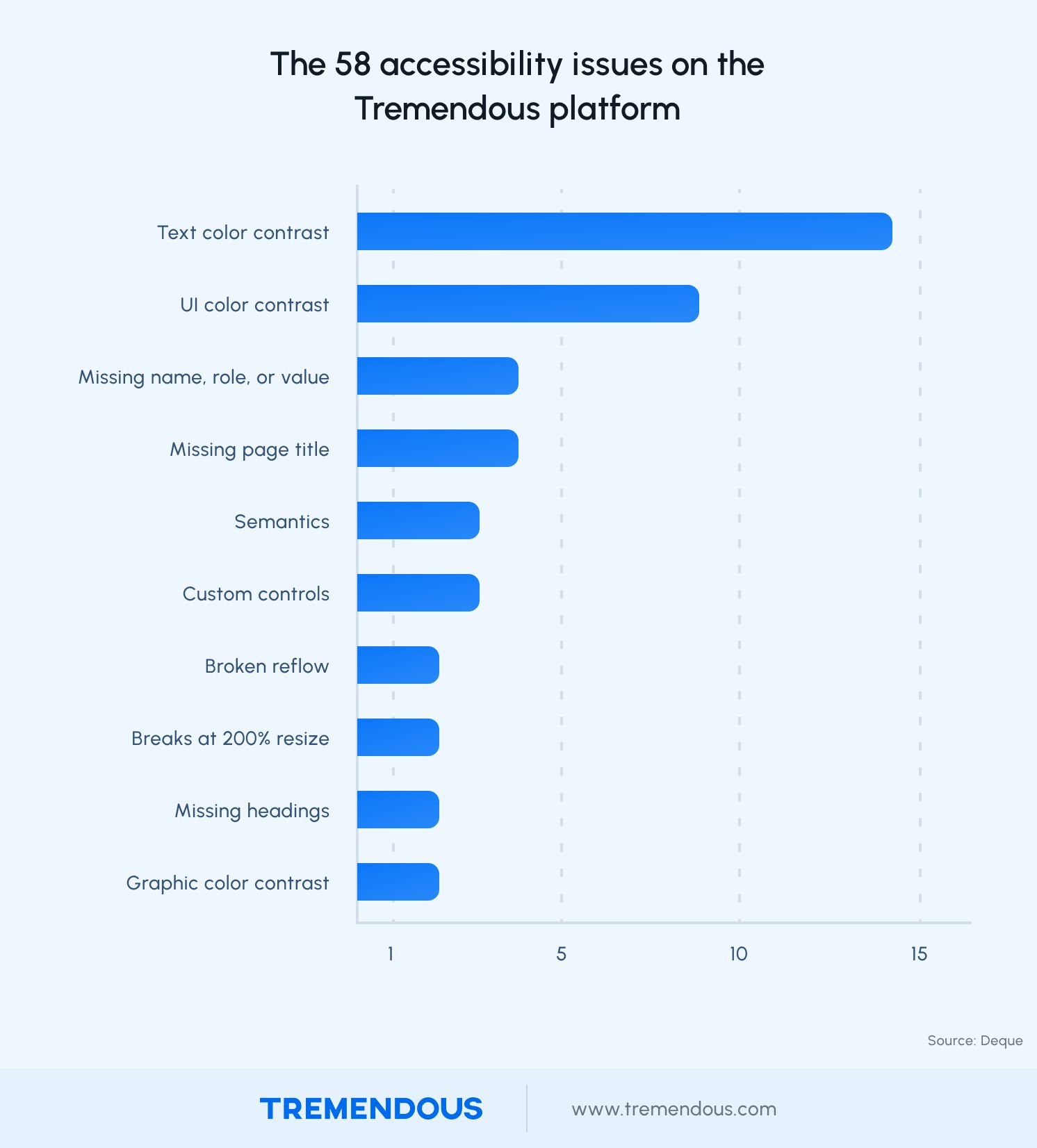
Examples of these issues include:
Proper implementation of buttons and links so that it’s clear when an action is required (in which case, it’s a button) or when something is simply linking to additional web content (in which case, it’s a link).
Using headings in a consistent manner so that screen readers can make sense of them.
Including more ARIA attributes, which are used to enhance the label descriptions of elements so that screen readers can interpret them. For example, text describing different input fields in a form.
Making error messages clearer and easier to understand.
Implementation
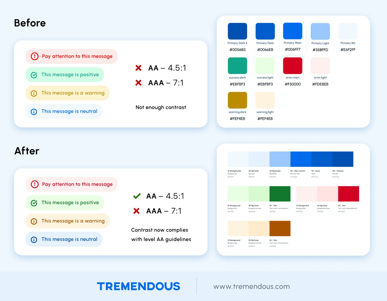
To make our site more usable for people relying on magnifiers and screen readers, we increased color contrasts for headers, footers, and buttons throughout our site.
For example, we darkened all shades of black and gray to provide readable, WCAG 2.0 AA compliant levels of contrast.
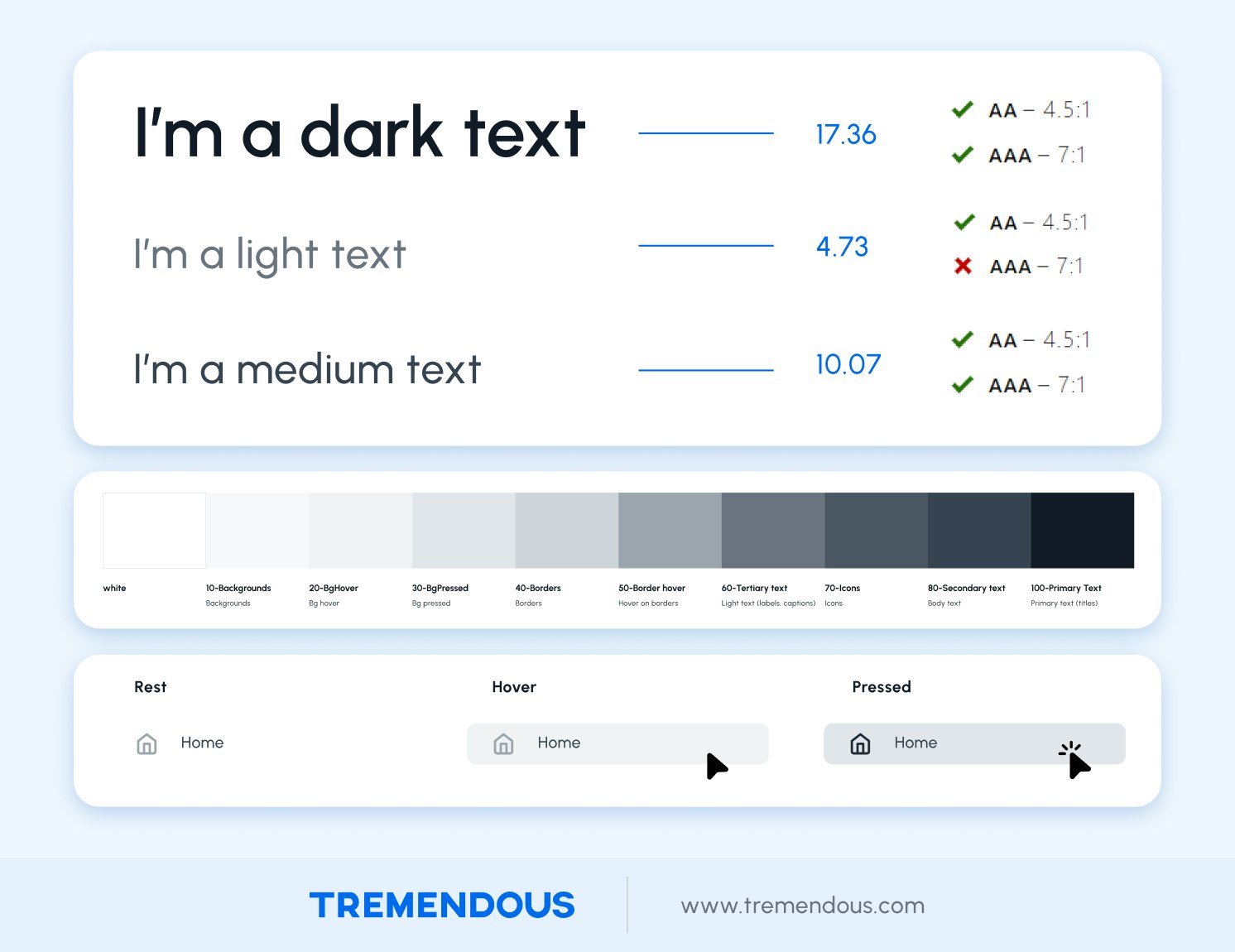
In our error messages in the image below, you can see how the previous color combination didn’t meet accessibility standards. The difference is subtle to some, but for others it’s the difference between perceptible and imperceptible. These changes to our color palette brought us in compliance with WCAG 2.0 AA standards.
Difficulty filling out forms is one of the most common accessibility issues encountered on the web. We went through and ensured that all form inputs included the appropriate ARIA labels.
Here’s an example:
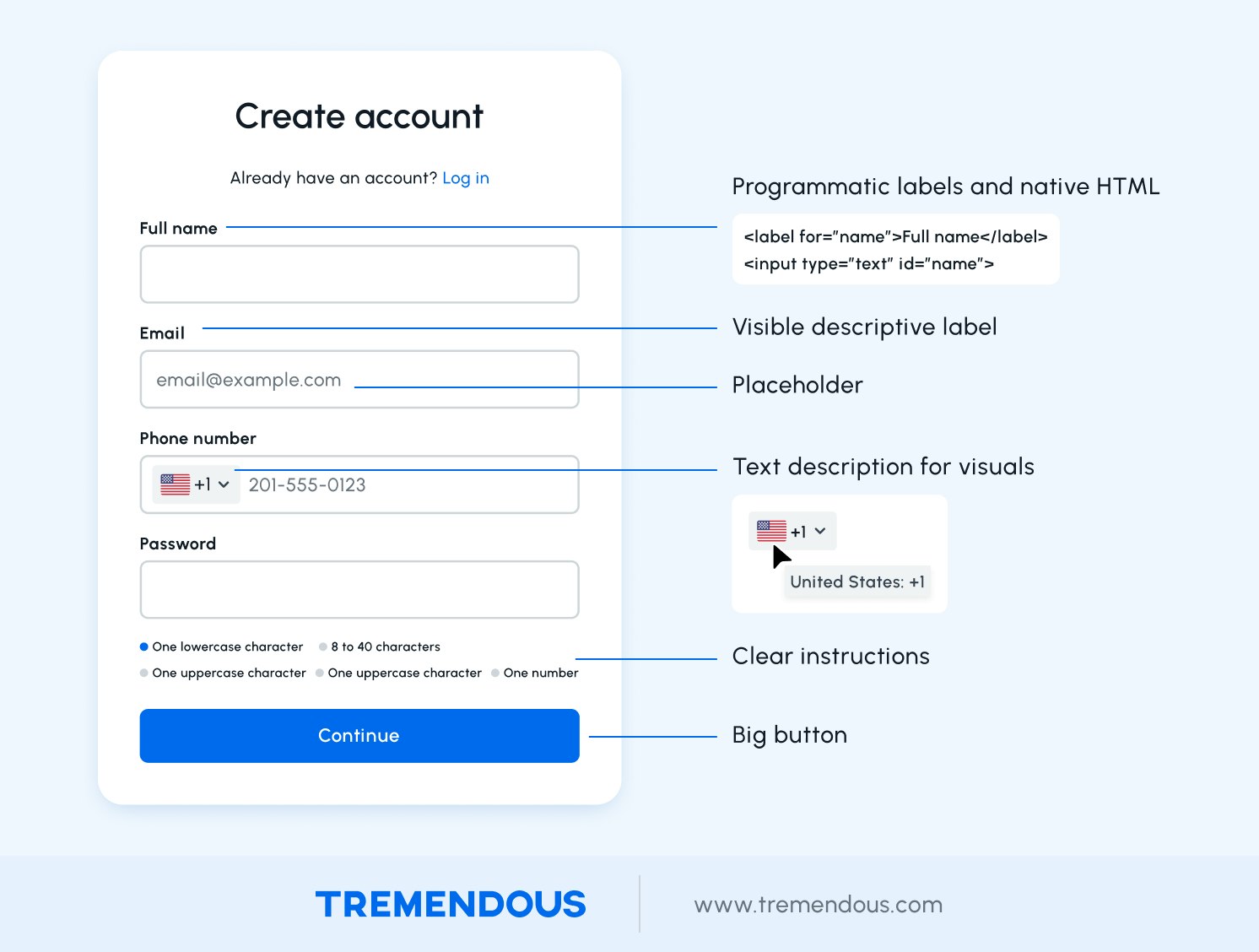
We also added text descriptions for all visuals, so that screen readers can properly interpret them.
For example, in the image above, there’s a description for an international telephone code, which now clearly reads “United States +1” in addition to the American flag.
We also adjusted our design standards and processes so that we can more easily adapt along with the WCAG standards and assistive tech in the future.
Commitment
For those that rely on accessibility tools, redeeming a reward on Tremendous is easier than ever.
From Google’s initial request in late 2021, we spent months auditing our platform and another couple of weeks implementing the changes to bring us up to WCAG 2.0-Level AA compliance.
Now anyone can issue payouts to those using assistive technology, ensuring equal access to those living with disabilities.
“Tremendous prioritized accessibility product improvements to create an all-around better experience for all our users,” said Lily Chai, Google UX infrastructure program manager. “We've received positive responses from our users and it's helped Google deliver on our promise to build products for all types of users globally.”
Moving forward, all product updates will adhere to the Web Content Accessibility Guidelines (WCAG), the gold standard for internet accessibility.
Resources
If you’re interested in learning more about accessibility, here’s a few resources we found valuable.
“Understanding the Web Content Accessibility Guidelines”: A series of articles to help you understand the steps to take to conform to the recommendations outlined in the W3C Web Content Accessibility Guidelines 2.0 or 2.1.
“10 a11y mistakes to avoid”: Changelog’s podcast interview with Spotify’s Tryggvi Gylfason about common accessibility mistakes and tips for avoiding them.
10 Usability Heuristics for User Interface Design: Jakob Nielsen's 10 general principles for interaction design. They are called "heuristics" because they are broad rules of thumb and not specific usability guidelines.
The a11y Project: This open source initiative that aims to make web accessibility easier. It includes tips, tutorials and information on how to test for better accessibility.
Inclusive Components: A blog about designing inclusive web interfaces, piece by piece.
a11y Savvy: A podcast hosted by a quality and accessibility engineer that explores how to design and develop for web accessibility.
Accessibility Wins: Curated by Marcy Sutton, this site provides examples of how to implement accessibility.


